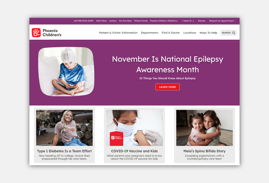
As one of the leading children’s health systems in the Southwest, Phoenix Children’s is rapidly expanding to meet the community’s growing needs, offering a full range of medical care from the earliest years onwards. With several new in- and outpatient facilities opening, Phoenix Children’s engaged Additive to help key audiences better navigate their offerings, champion their mission, and understand the breadth and depth of their care, innovation and education.
Key Deliverables
Phoenix Children’s wanted to ensure that patients and families could quickly connect to the care they need, especially given the stress and worry that can come with having a child who needs medical care. Working together, we developed a comprehensive brand architecture system for naming campuses, clinical locations and other offerings, resulting in greater consistency and a more seamless patient experience.
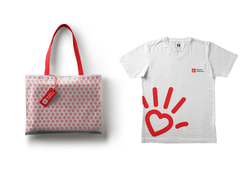
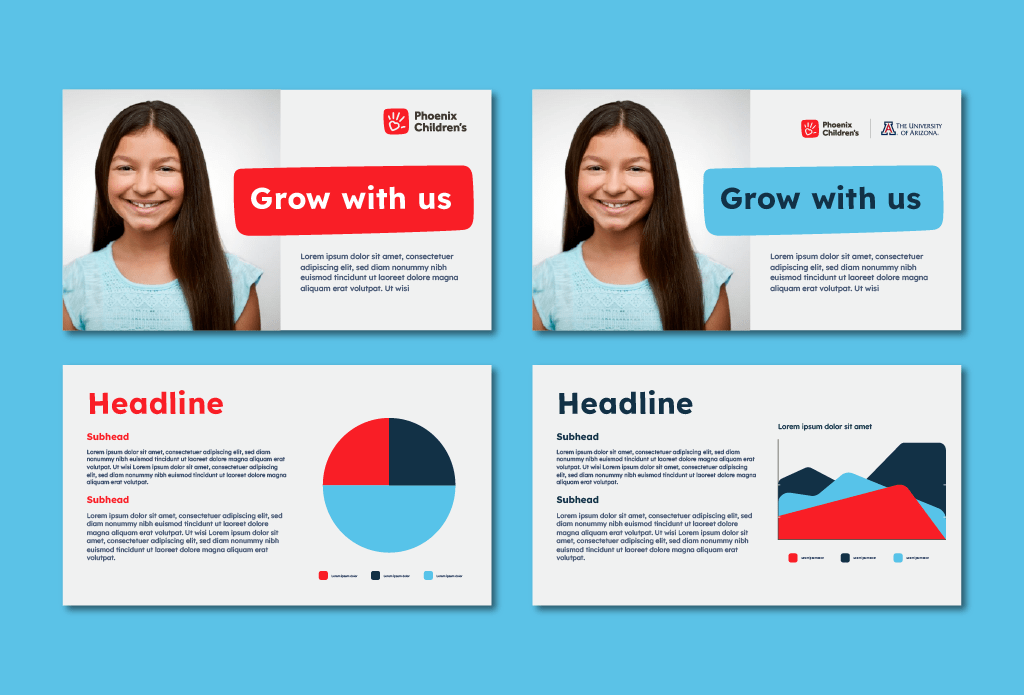
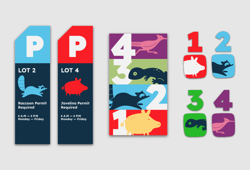
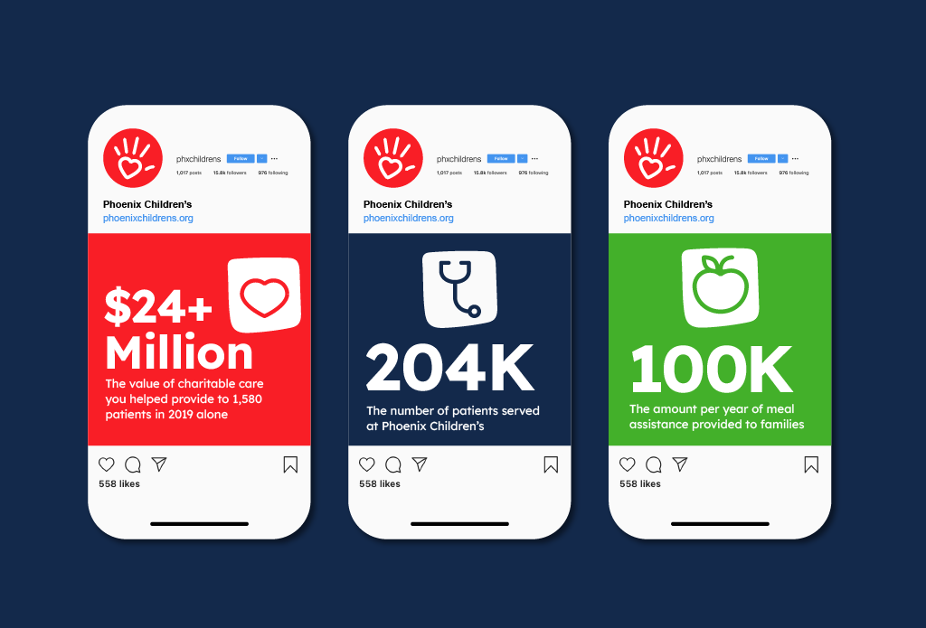
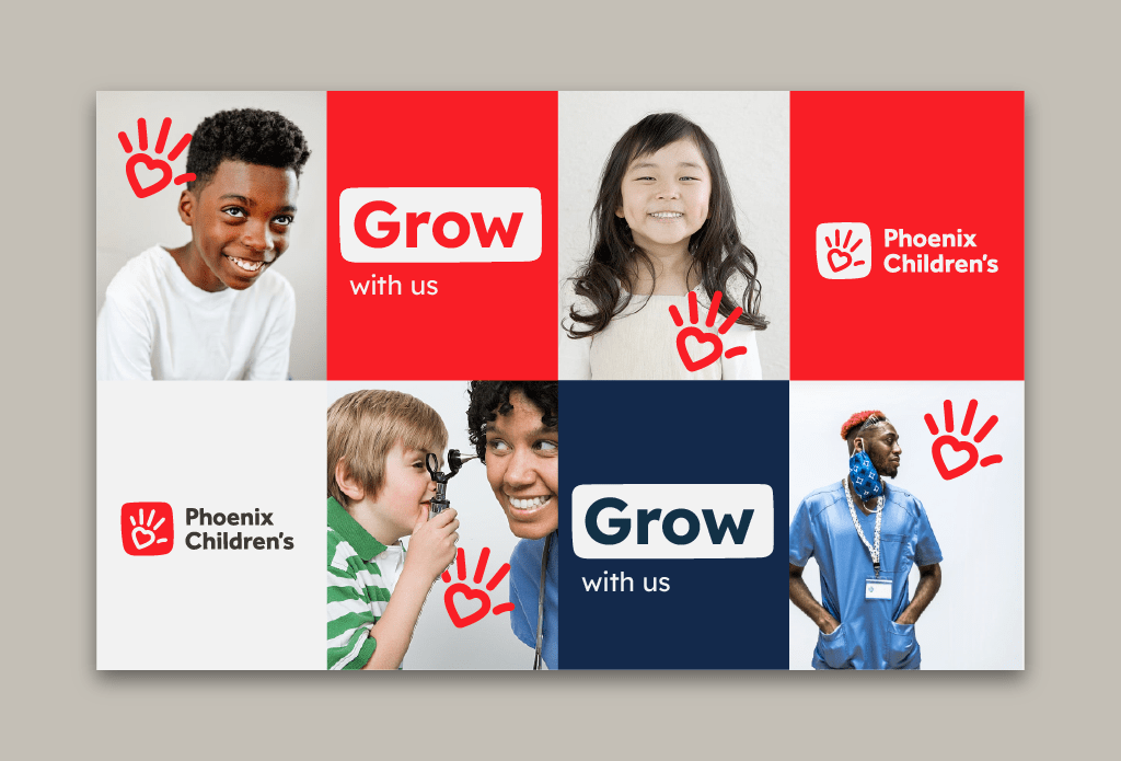
Simultaneously, we evolved their visual identity and guidelines, building on Phoenix Children’s current brand equity while creating versatility — not only across offerings, but also audiences and formats. We also created graphic elements, data visualization and two illustration styles for professional and consumer audiences. Together, these updated elements give the entire health system a warm, welcoming look and feel that reflects the patient and family experience.
We then partnered with Phoenix Children’s to crystallize their organizational and brand strategies to further elevate their current strengths and achieve their future goals. This process involved qualitative interviews with key stakeholders, a quantitative employee survey, and a rigorous review of in-house and peer communications. To activate and amplify the strategy, we crafted both universal and audience-specific messaging to show how Phoenix Children’s is advancing hope, healing and the best healthcare for children and their families.
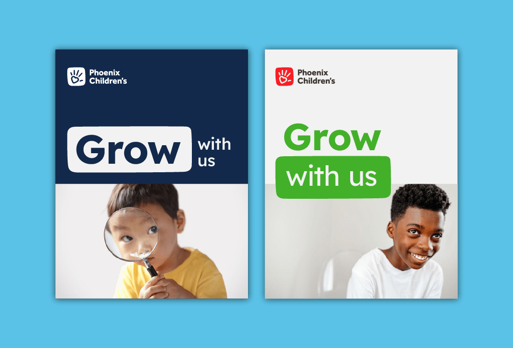
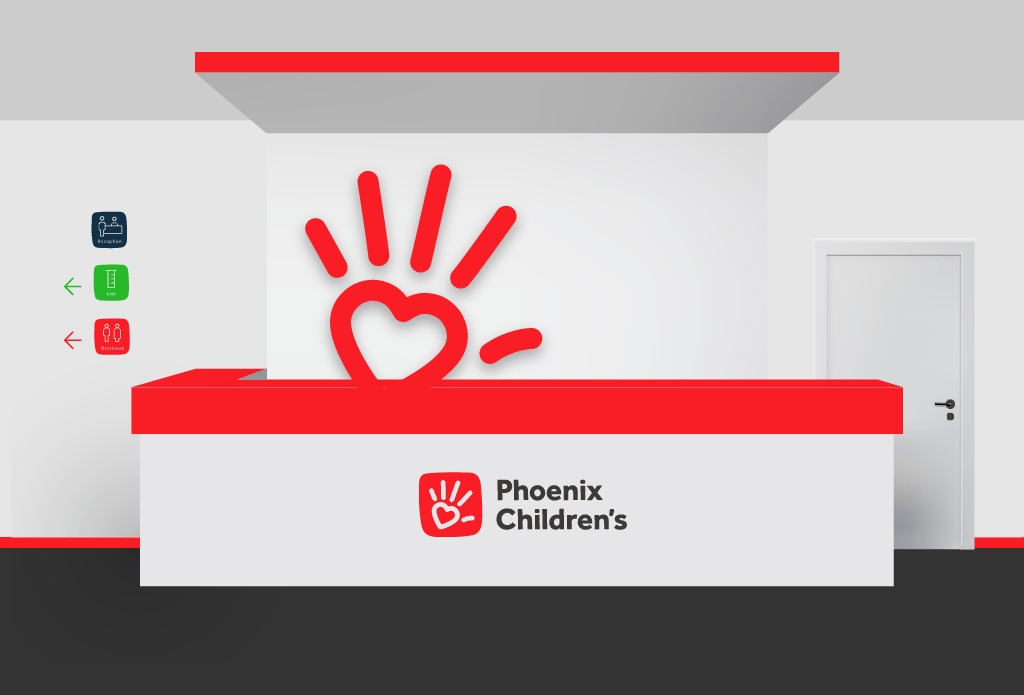
Phoenix Children’s has begun to implement the strategy, naming and brand architecture recommendations as new locations have opened across the region. The visual identity has been activated across physical environments as well as print and digital channels. Staff and supporters alike have embraced the illustration system, featuring Arizona wildlife, and the illustration-based T-shirts are now the top-selling item in the gift store, inspiring delight among all.
