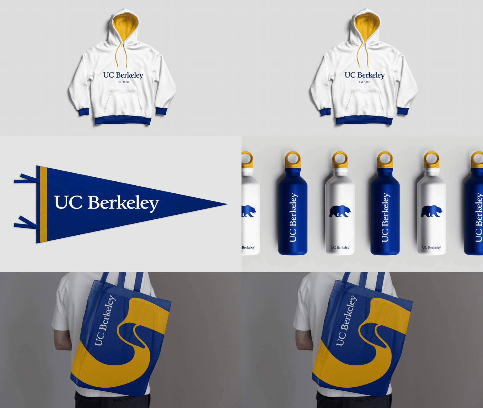
UC Berkeley is the founding campus of the University of California system and one of the top public universities in the world. Even with its strong reputation, the university faces a unique branding challenge with two coexisting identities: “UC Berkeley/Berkeley” for academics and “Cal/California” for athletics.
In 2022, a cross-functional task force was formed to create a framework for expressing these identities with greater clarity. The Association of American Universities (AAU) conducted quantitative research, while Additive led qualitative and desk research. Following this foundational work, Additive was engaged to evolve and expand the visual system to build more connection and coherence between academic and athletic identities.
Key Deliverables

We began by conducting interviews and discussion groups with over 60 key stakeholders and analyzing survey results from more than 15,000 students, alumni, faculty, staff and the general public across the Bay Area, California and the U.S. We also analyzed strategic materials and peers to understand how peer institutions bring together their academic and athletic identities while maintaining distinction for targeted audiences.
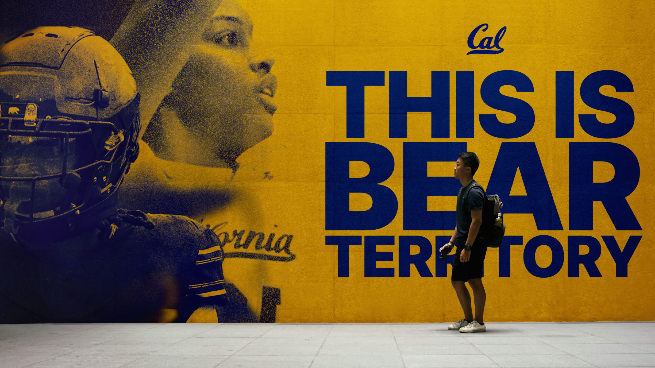
Our analysis revealed that the lack of connection between the two identities caused external confusion and internal diffusion. Each identity brought its strengths and reputation: the UC Berkeley identity scored particularly well on academic excellence, while Cal inspired a sense of pride and community among familiar audiences. From there we developed a framework to bring the identities together both verbally and visually, with the task force and president’s cabinet ultimately selecting their preferred direction.
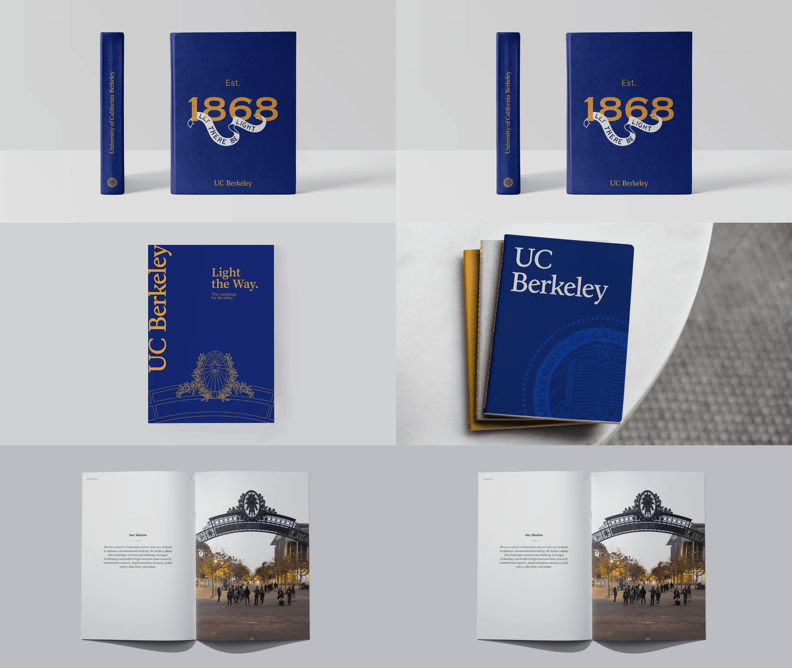
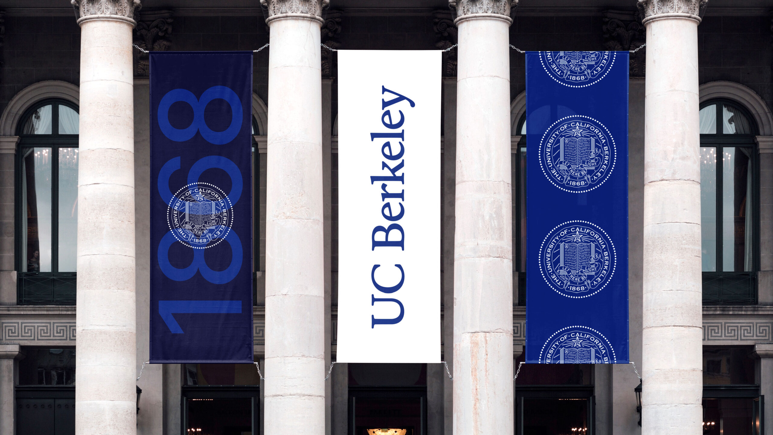
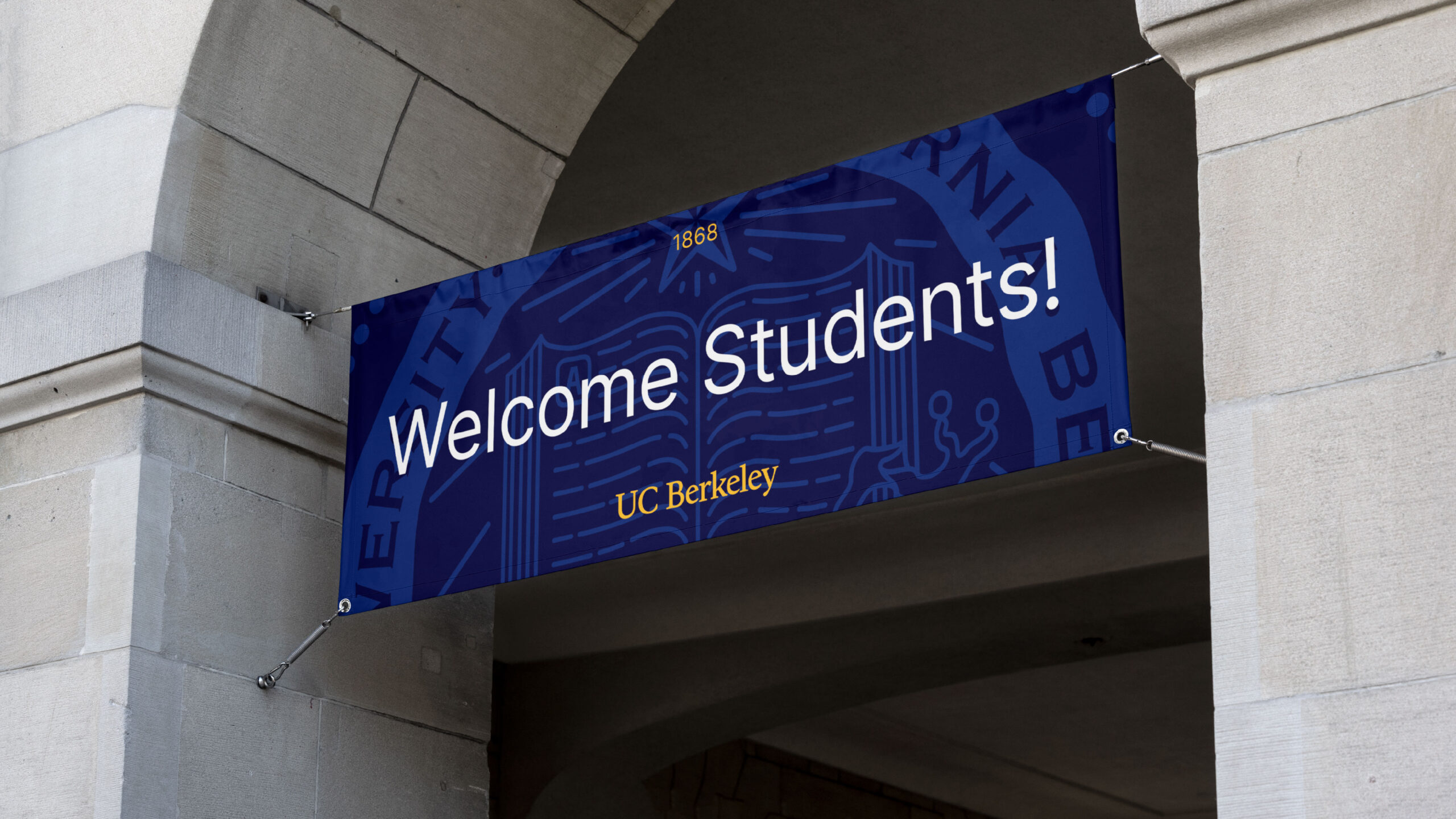
Building on the selected direction, we worked with the UC Berkeley and Cal teams to develop a more cohesive visual identity. The shared elements of the visual identity system — color palette, typography, photography style, illustration style and graphic elements — were designed to help the two identities live more harmoniously. Working with our partners at MCKL Type Foundry, we also refined the UC Berkeley logotype. Drawing inspiration from famed type designer Frederic Goudy’s California typeface —created more than 85 years ago for the University of California Press — we refined the rendering of the logotype for new media while incorporating subtle touches that connect to the Cal Script. Based on the refined logotype, MCKL created a custom typeface for UC Berkeley to use in its signature system and signature communications.
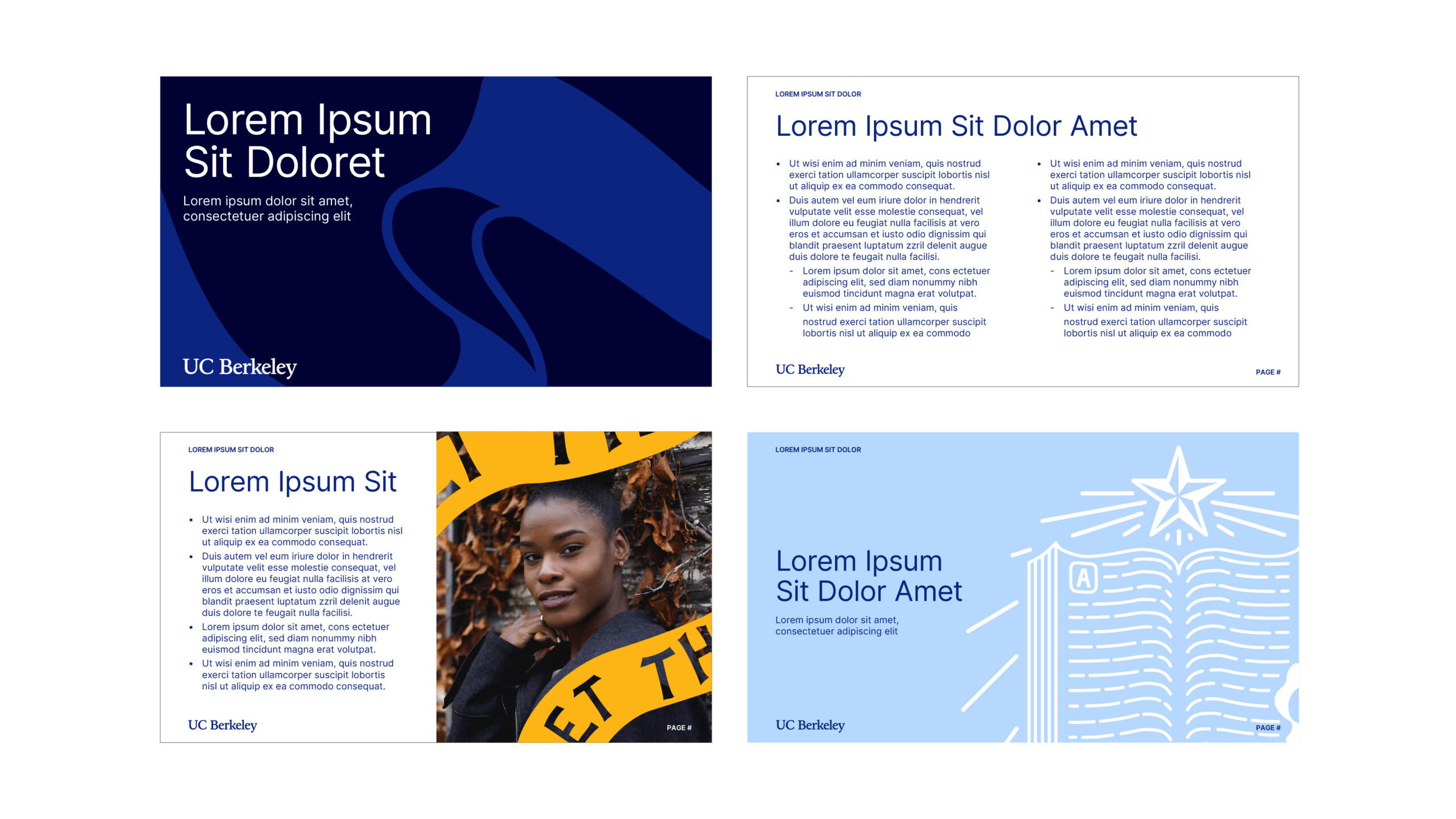
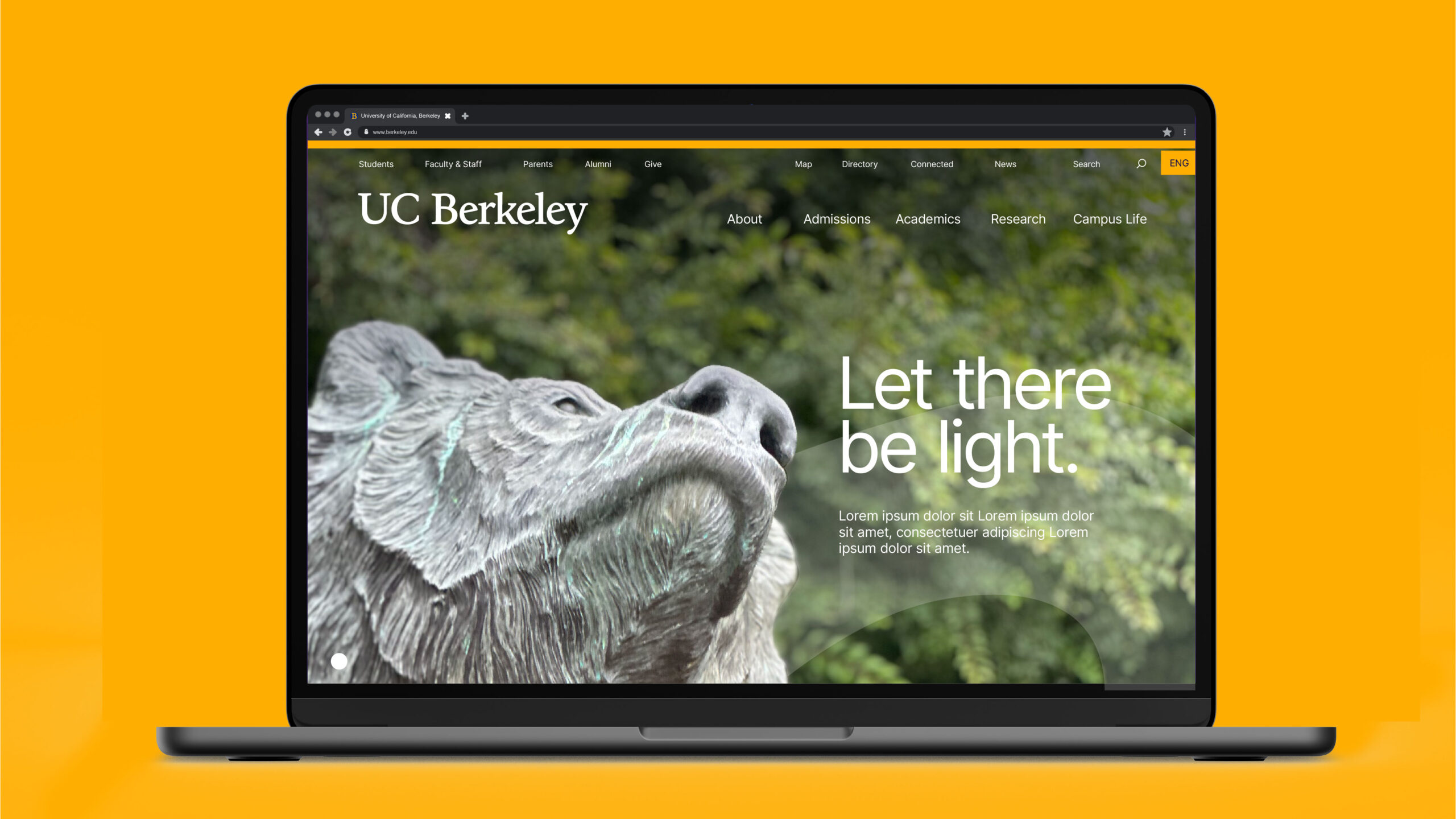
In a phased approach starting in 2024, UC Berkeley rolled out its new visual identity with prominent activations spanning its California campus to the New York Stock Exchange. To unite communicators around the identity and its refreshed visual expression, the university launched a UC Berkeley brand website featuring tools, templates and resources to learn and live the brand.
