Shining light on educational inequity and opportunity
Opportunity
Education Post isn’t just one bold voice addressing important issues in education, but part of a collection of many. As a platform, it brings together underrepresented perspectives — from parents, teachers, and kids themselves — that confront the inequities in education in order to build momentum for reform.
Read More
Results in Education Foundation (RIEF) was the nonprofit organization behind Education Post, and also supported other standalone platforms and programs focused on education that shared no visual or verbal connections. As a result, most audiences were unaware of RIEF and unfamiliar with its breadth and depth of impact, making it difficult to move its mission forward.
Guided by a strategic planning process, RIEF determined that it was time to highlight its unifying role and harness the full power of its network to mobilize action. In the fall of 2019, RIEF partnered with Additive to reconsider its brand architecture and revitalize its visual identity to better connect its offerings and activate its audiences.
Key Deliverables
Naming
Brand Strategy Consultation
Brand Architecture
Visual Identity
Signature System
Templates
Implementation Strategy + Support
Strategy
Every day, in neighborhoods across the nation, RIEF sees an education system that fails our children, and uses its platforms and partnerships to focus attention on communities that demand better.
While its platforms are people-powered and impact-driven — a differentiating and distinct strength — its name didn’t fully capture these aspects. There was an opportunity to better tell their story with a new one.
Read More
Working closely with the RIEF team, we selected the evocative name “brightbeam,” which more effectively shows how the organization shines a light on pressing issues and reflects a constellation of voices working together to inspire action. It’s optimistic and dynamic, embodying the organization’s mission to demand a better education and a brighter future for every child.
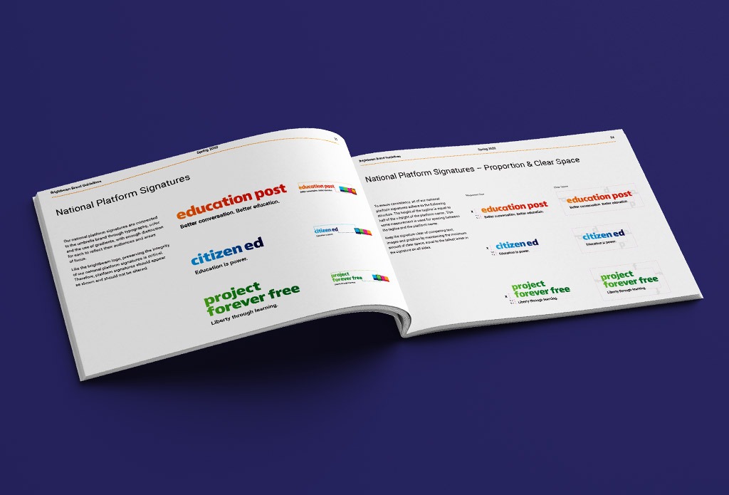
With brightbeam now the organization’s North Star, the next task was to align its portfolio, and clarify the connections across all that they do. With a mix of national and regional platforms, as well as collaborations with external partners, it was necessary to ensure that they connected more intentionally to brightbeam.
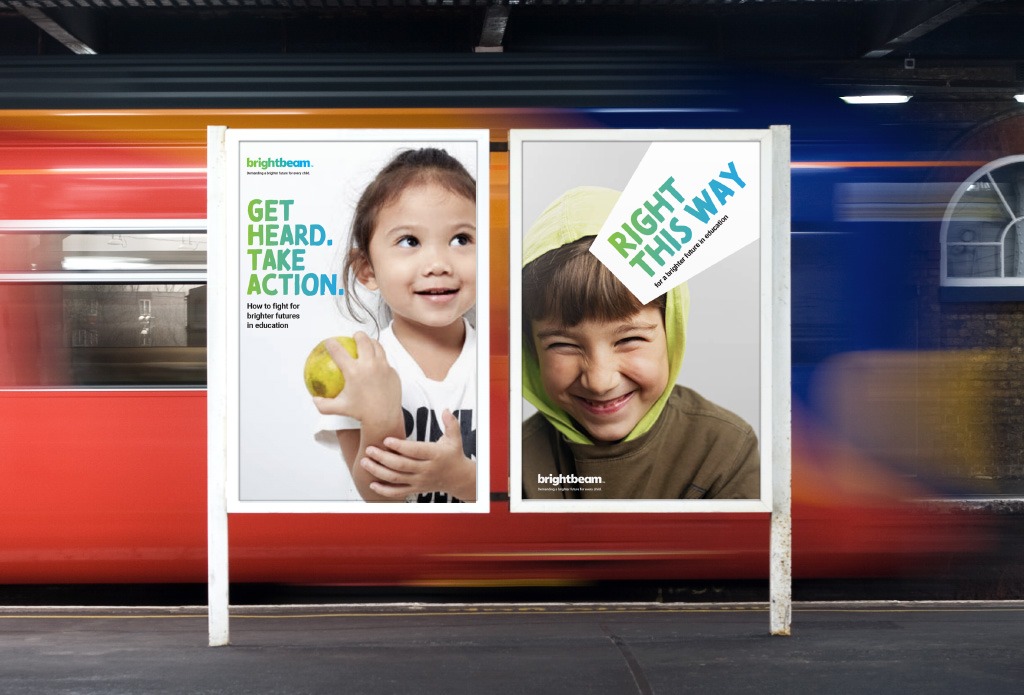
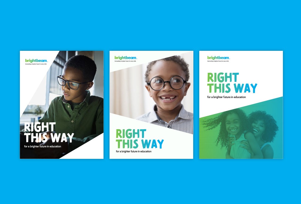
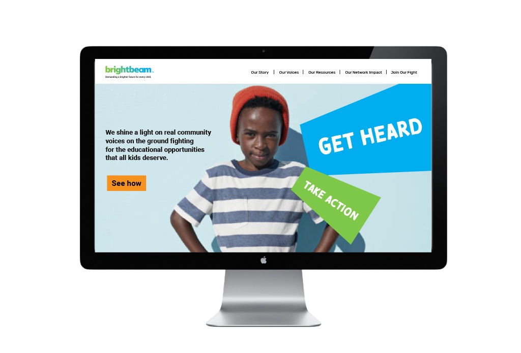
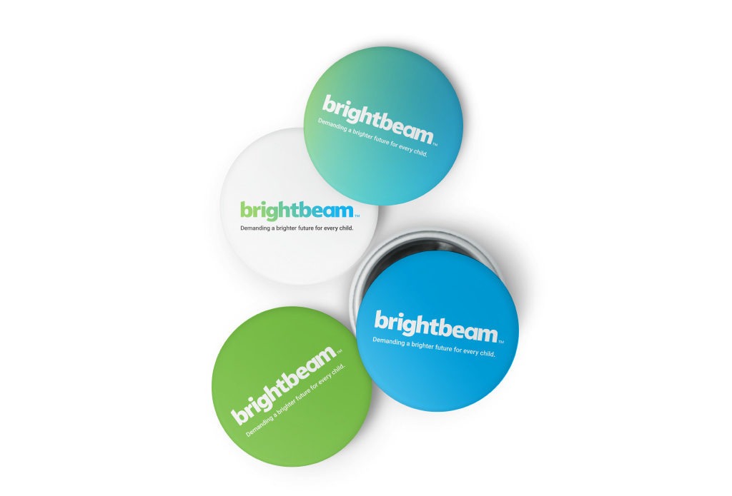
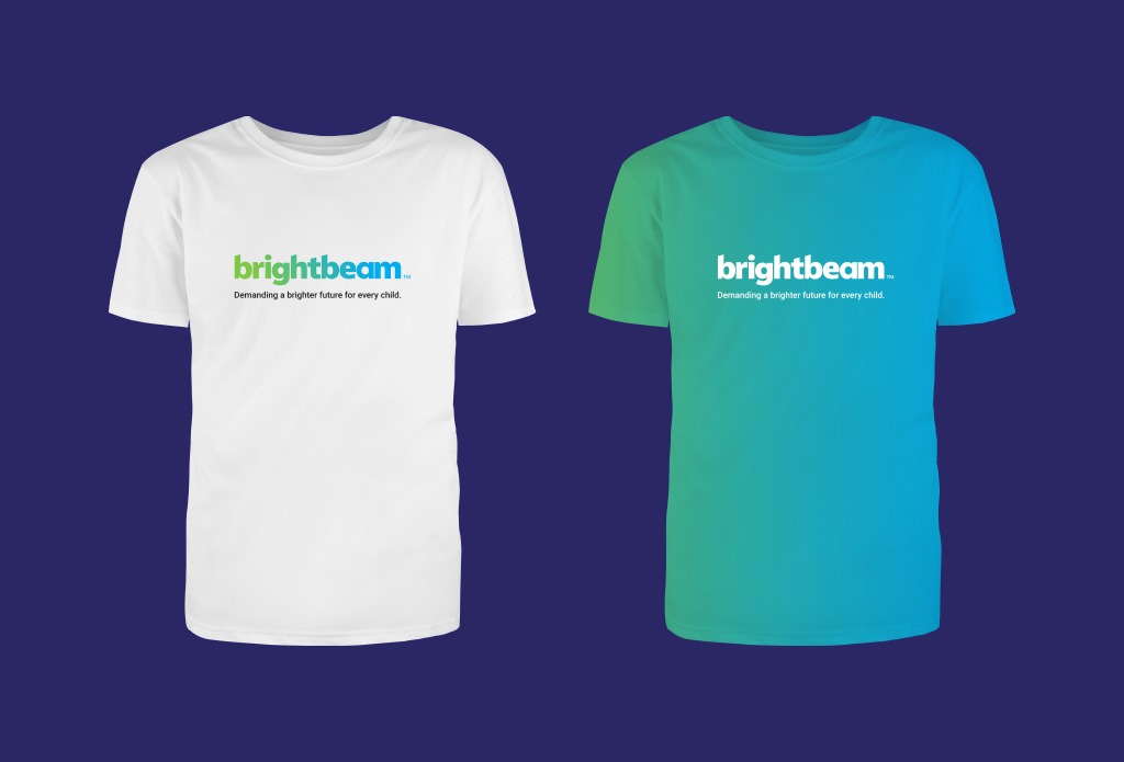
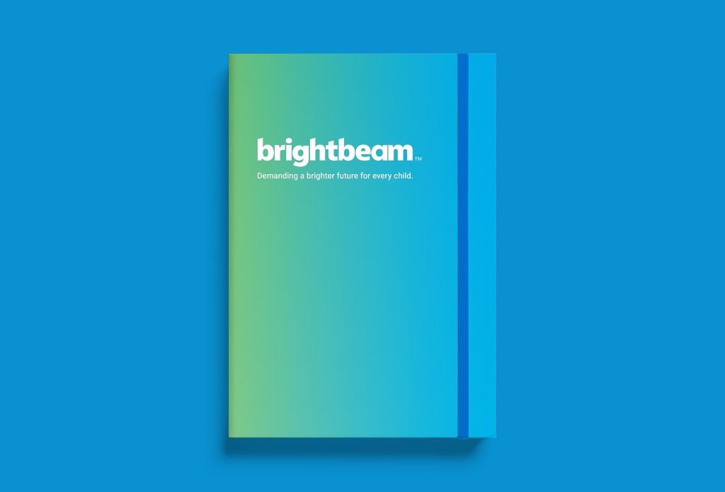
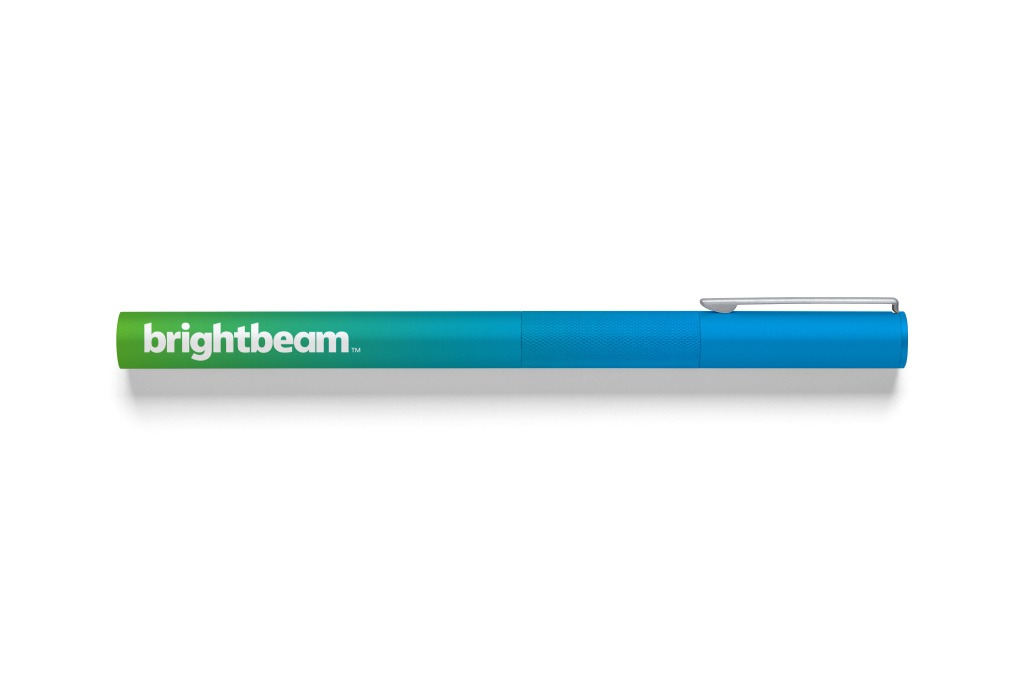
After establishing a brand architecture structure, we embarked on a process to develop a visual identity system that would bring the brand to life and cascade across platforms. The customized logotype has letterforms that echo the angles of both a beam of light and a megaphone — a symbol of how the organization helps raise the volume of its contributors’ voices for their shared cause. The logo also introduces a left-to-right color gradient that serves as a reminder of the brighter future ahead for every child. The graphic elements and gradated colors can also be applied to national platform signatures and partner assets, like affiliate badges — all tying back to brightbeam’s people-powered impact.
Results
In spring 2020, to coincide with the release of a major research report, brightbeam rolled out the new brand, including a new organizational website and a refresh of all national platforms.
With a more unified presence, brightbeam is well positioned to amplify its impact — shining light on communities and challenging decision-makers to provide the learning opportunities all children need to thrive.
“Having worked with Additive in the past, I knew the team had the experience and expertise to help bring our new mission to life. The team delivered a robust strategy complemented by a vibrant visual identity that helped us show our impact across all of our people, platforms and programs. And they did so with a level of client service that is second to none.”