LubDub Theatre Co. is a New York-based physical theatre company that presents new and unconventional work focused on issues like the global climate crisis. The company has staged sold-out productions in unusual formats and settings, including the Public Hotel in New York City and a Postal Play, wherein audience members participated through the U.S. Mail.
Read More
LubDub partnered with Additive to develop a visual identity that would match its innovative programming. Drawing inspiration from the company’s name, which is the technical term for a heartbeat, we designed an iconic and dynamic visual identity.
Key Deliverables
Visual Identity
Guidelines
Strategy
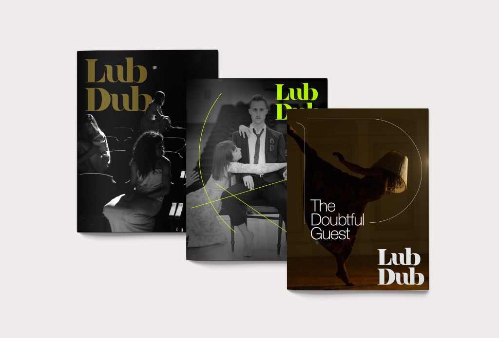
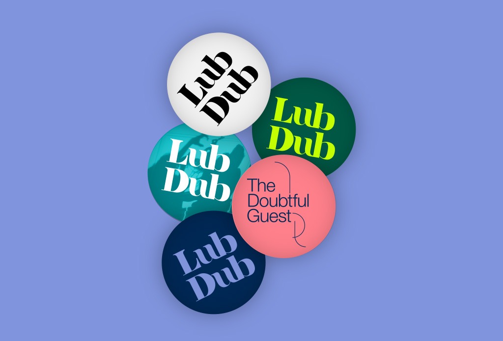
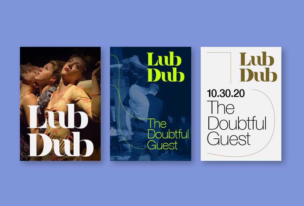
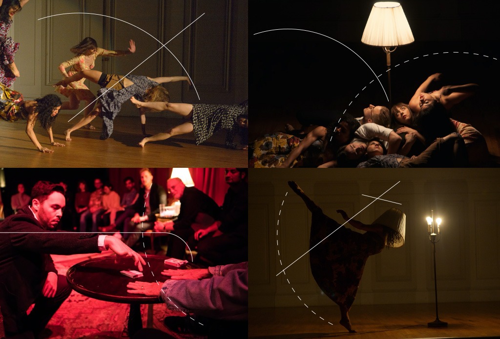
Movement and space are central to LubDub’s work, so we infused a sense of motion throughout the visual identity, beginning with the logotype. Rendered in a custom typeface, it captures the elegance and delight of physical theater, while idiosyncratic details — including the dynamic letterforms and dramatic contrasts — keep audiences engaged and evoke energy and enthusiasm. The friendly curves coupled with the strong vertical bars and ascenders balance a sense of playfulness with LubDub’s considered approach to addressing today’s most pressing issues through art.
Read More
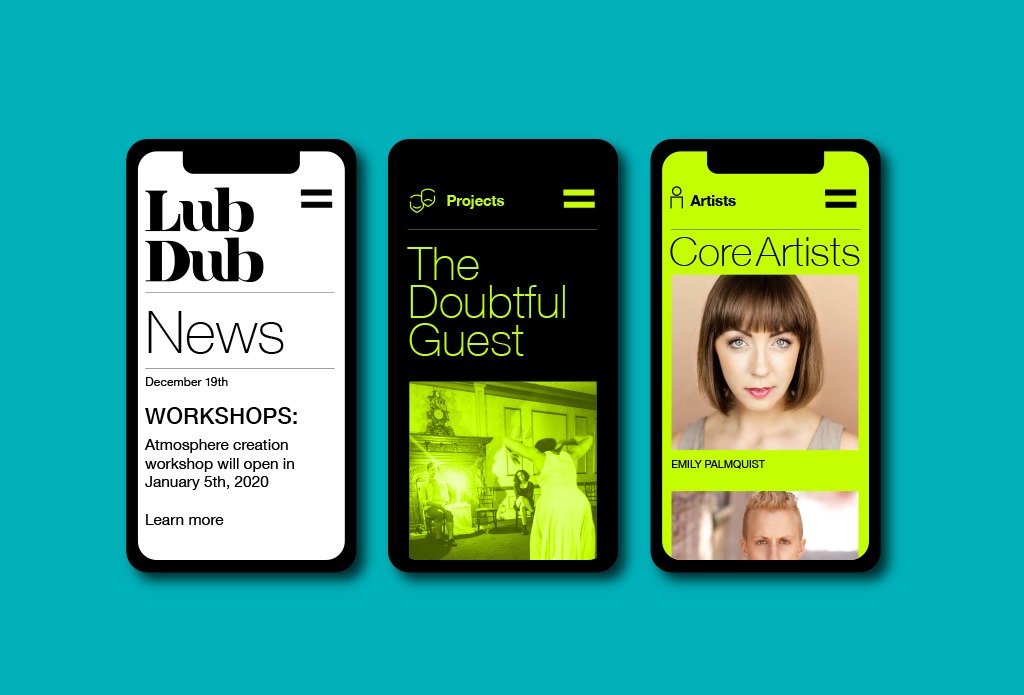
To translate the action on stage into a static format, such as posters or other promotional materials, we visualized movement with a suite of visual elements derived from the logo’s letterforms. In application, these elements can be used to emphasize areas of motion or visual interest. The visual elements can be rendered in a variety of styles — including thick and dotted lines — to evoke different speeds and types of movement, while still harmonizing with the rest of the composition.
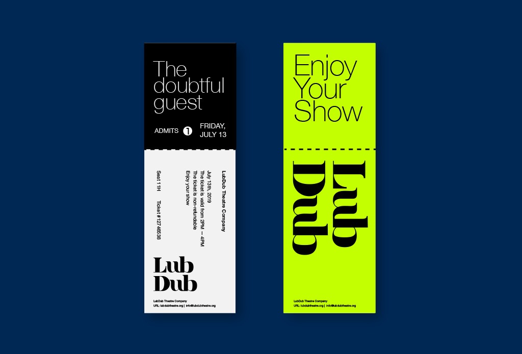
For LubDub’s color palette, we explored complementary high-contrast pairings that allude to the push and pull of a beating heart. The primary color is black, which evokes the anticipation in a darkened theater before the curtain rises, as well as the excitement and satisfaction after the curtain falls. Against this background, bright secondary colors — including a neon green and bright teal — inject energy, action and a hint of irreverence into compositions. The secondary color palette also allows for the use of alternate background colors, including dark blue and dark green, to expand possible pairing options and keep compositions fresh and eye-catching.
Results
LubDub rolled out its new visual identity in April 2020 across formats and touchpoints, including an appearance on PBS’ En Garde Arts. As their presence has grown, both in the United States and internationally, the visual identity system has adapted and expanded to new contexts and applications.
“Additive was a dream team from the start — they listened deeply and took the time to really understand us and the work we make. They guided us through the process of translating mission and ethos into a visual identity with great communication, generosity, and creativity. We’re not only thrilled with the result; we’re inspired.”
–Caitlin Nasmea Cassidy and Geoff Kanick, LubDub co-artistic directors