
Welcome back! For this week’s Summer School session we’ll be taking a closer look at developing a brand’s visual identity, the part of the brand building journey where the strategy comes to life as visual expression.
Creative Brief
Before visual design begins, it’s important to develop a creative brief that captures all of the core parameters including objectives, audiences, brand strategy elements and any important considerations to guide the design process. Ultimately, the brief should create clear direction for creative exploration.
Visual Identity Exploration
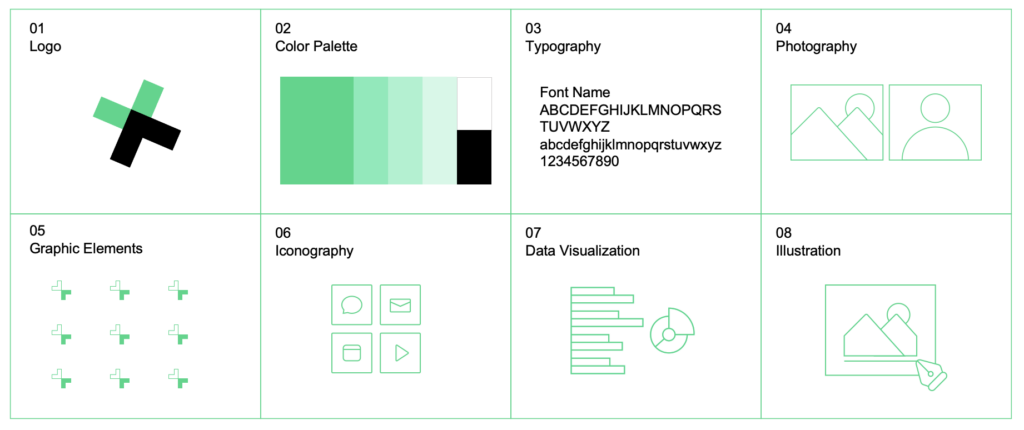
A visual identity is more than just a logo — it’s a system that captures the look and feel of a brand. With the brief as guide, you can explore different approaches to visualizing the brand strategy, including logos, colors, typography, graphic elements, photography, iconography and illustration styles. This visual system extends the organization’s creative expression to provide a rich and vibrant toolkit for storytelling. Core visual identity elements may include:
- Logo: The primary logo symbol and/or logotype that visually identifies a brand. When thoughtfully designed and consistently applied, the logo is a powerful asset that can enhance brand recognition
- Color Palette: Primary, secondary and/or tertiary colors chosen specifically to reflect the distinct personality of a brand. Color values ensure that brand colors are optimized and appear consistently across environments
- Typography: Encompasses the technique or art of arranging type so written communications are readable, appealing and/or distinctive. Brands usually select a typography style, which consists of a font or font family, that reinforces the brand’s personality and position
- Graphic Elements: Shapes, compositional forms, supergraphics and patterns that visually connect to the brand strategy, story or other strong assets and associations within the organization (e.g., legacy logo, university seal)
- Iconography: Simple symbols that enhance comprehension and navigation by quickly drawing attention to important messages or actions audiences should take. Icons should be simple and intuitive to understand, can be distinct in style, and are helpful when conveying messages to multilingual audiences
Other visual storytelling elements include photography style, illustration, animations and data visualization.
Guidelines Development + Asset Delivery
As you may remember from a few weeks back, the brand personality plays a large role in this process — it sets the tone and style of all brand communications. These attributes now become part of the criteria to assess the creative directions against along with the more functional requirements. These include color testing, accessibility, small space rendering and other considerations to ensure utility and extendibility.
Once established, the visual expression of the brand should now be crystallized in guidelines or a toolkit, with guidance on how to use all the elements from the logo(s) and color palette to typography and imagery.
By following these steps, you can develop a visual identity that not only differentiates you from your peers but also provides flexible visual expression to amplify your organization wherever you go.